Trasparenze – The Ultimate Period Piece, Part I
Have you read our Trasparenze Mega Post? You should, it’s great!
Read it yet? Good!
We are starting a new series today. After our promise to write shorter, better reviews, we also pledged to review some of the items from our Mega Post again. So many of these Trasparenze pieces deserve extra attention! Their whole collection is fantastic, but some follow a single theme that we wanted to write on.
Period pieces. They’re sorely missing from fashion today. Prada did a couple of early 20th Century pieces over the last few seasons, but Trasparenze is going down the more ostentatious road.
Trasparenze is going back much further!
Angie
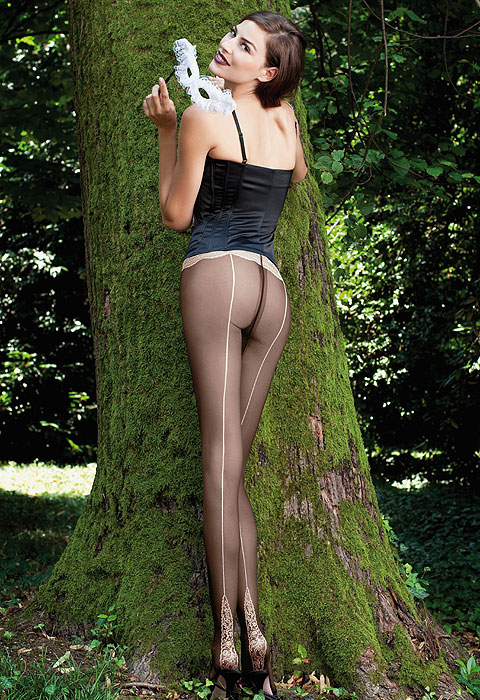
The piece we are talking about today is Trasparenze Angie. This design is beautifully realised and they’re using a technique we really admire. Contrasting patterns. Trasparenze have made the full leg of the tights simple. Almost uneventful. The materials are well-made, the colours are perfectly balanced, but there’s nothing more than a simple seam and an uninterrupted leg.
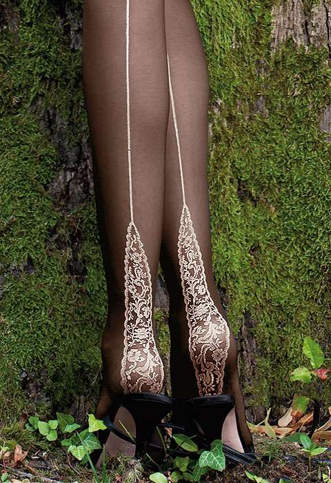
But all this is contrasted by the heel. The white filigree of Angie’s heel is a pattern straight out of old Europe. The intricate swirls that dominate the piece are beautiful white leaves twisting around crisp, delicate flowers. The tiniest gaps are sprinkled with minute rosebuds to give a full and rich body to the motif.
Contrast is so important for making something stand out and grab your attention. But the real art of Trasparenze and their collection comes from the ability to add just the right touch of subtlety to their designs.
The creative talent at Trasparenze has added the motif to the heel, making sure it follows the seem and stretches up the back of the leg. It’s like the flame of a candle. This is the real trick of the trade, the thing that can turn a design into a real work of art.
The effect of all this is? It’s the Holy Grail of hosiery. It lengthens the leg!
The Saga Continues…
We love to get into the real detail of a brands work. These reviews are a great way to really take apart a design. I’m going to turn this post into a series and wax lyrical about Trasparenze and their portfolio.
So, if you like what you’ve read so far, why not subscribe? It’s free and if you haven’t spotted it, it’s the big box to the top right.
Or you can add your own observations and opinions in the comments below, on Facebook or by Twitter, our personal favourite!

